
Translating raw data and information into a visual context by using visual elements like charts, maps, graphs, and maps is called data visualization. We are in the age of big data. So, data visualization techniques and tools provide an accessible way to see and understand trends, outliers, and patterns. They also help you tell stories to understand your customers on a deeper level.
There are several techniques available to visualize data on the market, each with its own strengths and weaknesses.
In this blog, we will explore the top 10 data visualization techniques for 2024 and beyond. By examining their features, pros, and cons, you can select the right tools for your business’s needs and improve your data analysis capabilities. Techniques drive insights—data visualization techniques for business insights include dashboards and storytelling.
Top 10 Data Visualization Techniques for 2024 & Beyond
Here are top 10 visualization techniques and tools used in data analytics in 2024 & beyond
#1 - Histogram

A histogram is a visual representation that displays the distribution of numerical data. It uses bars to show the frequency of data points within specified intervals, allowing for the visualization of the underlying frequency distribution of a set of continuous data.
Example: Displaying the age distribution of a population.
Strengths:
Easy to interpret.
Clearly shows frequency distribution.
Weaknesses:
It can be misleading if bin sizes are not chosen carefully.
Case Study: In healthcare, histograms can display patient age distributions, helping in resource planning for different age groups.
2. Heatmaps

Heatmaps are visual representations of data where individual values contained in a matrix are represented as colors. This technique is beneficial for displaying the density or intensity of data points over a two-dimensional space, such as geographical locations or the correlation between variables.
Example: Showing website user activity across different sections of a webpage.
Strengths:
Visual representation of data density.
Excellent for showing correlations.
Weaknesses:
It can be overwhelming with too much data.
Case Study: In marketing, heatmaps are used to analyze customer behavior on e-commerce websites, improving UI/UX design based on user interaction patterns.
3. Line Charts

Charts are graphical representations of data designed to present information quickly and clearly. Common types of charts include line charts, which show trends over time, and scatter plots, which depict the relationship between two variables.
Example: Tracking stock prices over time.
Strengths:
Excellent for showing trends over time.
Easy to understand.
Weaknesses:
It can become cluttered with too many lines.
Case Study: In finance industry, line charts track financial metrics over time, aiding in investment decisions.
4. Bar Graph

A bar graph, or bar chart, uses rectangular bars to represent data. It’s used to compare discrete categories or groups of data.
Example: Comparing annual sales across different regions.
Strengths:
A simple comparison of categories.
Versatile for various data types.
Weaknesses:
Less effective for large datasets.
Case Study: In education industry, bar graphs are used to compare student performance across different subjects, helping identify areas needing improvement.
5. Pie Chart
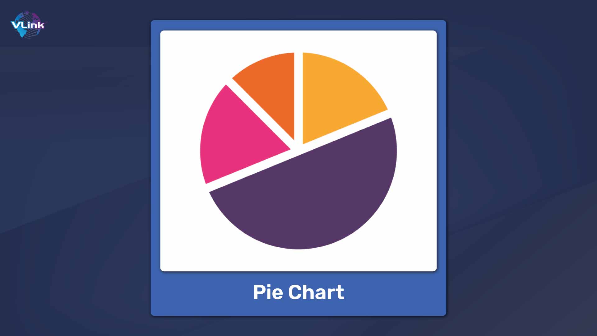
A pie chart is a circular statistical graphic divided into slices to show numerical proportions. Each slice represents a category's contribution to the whole, making it easy to compare parts of a whole.
Example: Market share distribution among companies.
Strengths:
Easy to understand proportions.
Weaknesses:
Hard to compare small segments.
Case Study: In business, pie charts are used to show company market share, facilitating competitive analysis.
6. Treemap

A treemap displays hierarchical data using nested rectangles. Each branch of the hierarchy is represented by a colored rectangle containing smaller rectangles representing sub-branches. The size of each rectangle is proportional to the data value it represents.
Example: Visualizing the composition of a company's budget.
Strengths:
Displays hierarchical data effectively.
Good for showing part-to-whole relationships.
Weaknesses:
It can be complex to interpret with too many levels.
Case Study: In finance, treemaps are used to break down investment portfolios by asset class, providing a clear overview of asset distribution.
7. Area Charts

Area charts are similar to line charts but with the area below the line filled with color or shading. They are used to represent cumulative totals over time, showing how different variables contribute to the whole.
Example: Showing changes in company revenue over time.
Strengths:
Suitable for displaying cumulative data.
Shows trends and volume.
Weaknesses:
It can be misleading if the baseline is not zero.
Case Study: In environmental science, area charts display changes in CO2 emissions over time, illustrating the impact of regulatory measures.
8. Funnel Chart

A funnel chart is used to represent stages in a process and show the flow and drop-off of data points through each stage. The width of each section represents the size of the data set at each stage, making it helpful in visualizing conversion rates and bottlenecks.
Example: Sales pipeline stages from leads to closed sales.
Strengths:
Ideal for visualizing process flow.
Highlights potential bottlenecks.
Weaknesses:
Limited to data with a clear progression.
Case Study: In sales, funnel charts track the customer's journey from initial contact to purchase, helping optimize sales strategies.
9. Word Cloud
A word cloud visually represents text data by adjusting the size of each word to reflect its frequency or significance. This technique is often used to visualize the most prominent terms in a body of text.
Example: Checking customer feedback to analyze common themes.
Strengths:
Quickly highlights the most frequent terms.
Weaknesses:
Needs quantitative precision.
Case Study: In marketing, word clouds are used to analyze social media mentions, identifying key topics and sentiments.
10. Gauge Charts

Gauge charts, also known as speedometer charts, display data in a dial format. They are used to measure and visualize performance or progress towards a goal, with the needle indicating the current value against predefined thresholds.
Example: Displaying key performance indicators (KPIs) in a dashboard.
Strengths:
Immediate visual representation of performance metrics.
Weaknesses:
Limited to single data points.
Case Study: Gauge charts are used in manufacturing industry to monitor machinery performance metrics, ensuring maintenance and efficiency.
By leveraging these tools effectively, organizations can gain deeper insights and make informed decisions, driving better outcomes in their respective fields.

Data Visualization Importance and Benefits
Here are the six most common data visualization importance and benefits for your business:
Enhanced understanding
Visuals enable quick insight generation by helping people grasp information and understand data patterns and trends. They simplify complex data structures, making intricate relationships and patterns accessible to non-technical users.
Improved decision making
Visualizing data allows decision-makers to clearly see patterns, trends, and insights, facilitating informed, data-driven decisions. Additionally, it helps identify outliers and unusual data patterns, aiding in early risk detection and mitigation.
Improved collaboration
Visual data serves as a universal language, enhancing communication and collaboration across departments. It enables compelling storytelling and simplifies the conveyance of insights to stakeholders.
Increased customer engagement
Interactive dashboards in data visualization tools empower users to explore data independently, fostering customer engagement and satisfaction. They also facilitate customized reporting and visuals, catering to the unique needs and preferences of various stakeholders.
Supporting goal tracking
Visualization tools help you in effectively tracking performance metrics and KPIs through customizable dashboards. They enable the transparent monitoring and achievement of strategic objectives, showcasing data-driven progress.
Data Visualization Best Practices
Here are a few best practices for visualizing the data:
Know Your Audience: Understand who will be viewing your visualization and tailor it to their needs and level of expertise.
Simplify Complexity: Focus on the most critical aspects of the data to keep your visualizations simple and easy to understand.
Choose the Right Chart Type: Select a chart type that effectively communicates the message of your data. Make sure to clarify your chart's purpose, whether to show data distribution, relationships, or comparisons.
Ensure Clarity and Accuracy: Double-check your data and ensure that your visualization accurately represents the underlying data without misleading interpretations.
Optimize for Interpretation: Arrange your visual elements logically and intuitively to guide viewers' eyes through the data and facilitate interpretation.
Design for Accessibility: Make your visualizations accessible to all audiences by considering factors like color blindness, screen reader compatibility, and font size.
Iterate and Improve: Continuously evaluate and refine your visualizations based on feedback and evolving data requirements to ensure they remain practical and relevant over time.
How to Choose the Right Data Visualization Technique?

Here are a few factors you need to consider when choosing the proper data visualization technique for informed decision-making:
Data Type: The nature of your data—whether it is categorical, numerical, or temporal—significantly influences your choice. For instance, bar charts are excellent for categorical data, while line charts are ideal for temporal data trends.
Purpose and Audience: It is vital to understand the visualization's objective and the audience’s familiarity with the data. Visualization for a technical audience might include more detailed and complex representations, while a general audience may benefit from more straightforward, more intuitive visuals.
Data Volume and Granularity: The amount of data and its level of detail affect the choice of visualization. For large datasets, summary visualizations like histograms or box plots might be more effective, while small datasets can be represented with detailed scatter plots or line graphs.
Comparison vs. Distribution: Different visualizations serve different purposes. Bar charts and pie charts work well to compare categories. Histograms and box plots are more appropriate for understanding data distribution.
Trends and Patterns: Line charts or area charts are suitable for highlighting trends over time. Scatter plots or heat maps can be more effective for identifying patterns or correlations.
Clarity and Simplicity: The visualization should be as simple as possible while still conveying the necessary information. Avoid overloading the viewer with too much information or overly complex visuals that can obscure the main message.
Interactivity: Interactive visualizations on digital platforms can enhance user engagement and allow deeper exploration of data. Tools like dashboards often incorporate interactive elements to enable users to drill down into specific data points.
Tools and Resources: The choice of visualization can also depend on the available tools and the user's technical proficiency. Advanced visualizations might require specialized software and skills.

Get Powerful Data Visualization Solutions with VLink!
VLink empowers businesses with robust data visualization solutions that transform raw data into clear, actionable insights. By leveraging VLink’s advanced tools and tailored industry solutions, you can drive informed decision-making, enhance operational efficiency, and achieve strategic goals.
Explore VLink’s data visualization offerings today and unlock the full potential of your data!

Vice President, Strategy – VLink Inc.
Sambhavi Gopalakrishnan is the Vice President of Strategy at VLink Inc., bringing over a decade of experience in IT leadership, project implementation, and strategic growth. She possesses a strong foundation in technical project management and pre-sales, driving innovation and business transformation at VLink.

 Shivisha Patel