No wonder an image is worth a thousand words! This quote goes well with data analytics, also!
Data visualization means representing reports or insights visually, using charts, graphs, and maps to tell a significant story. It’s an essential step in the data analysis that all business areas can benefit from. Python excels at visualization—data visualization benefits and challenges include choosing the right libraries.
If you have data you want to visualize, it’s essential to have proper knowledge about data visualization. In this blog, you will explore what data visualization is, types of data, tools & real-world examples.
What is Data Visualization?
Data visualization is turning complicated and heavy datasets into a visual format using graphics, & charts. It is ideal for entrepreneurs, stakeholders, and decision-makers.
Visualizations can enrich your reports, make text material eye-catching and capture your audience’s attention for the entire storytelling project.
Why is data visualization important?
Here are several reasons why data visualization is important for your business:
- Users can easily understand and interpret data, unveiling hidden patterns, trends, and correlations that might remain concealed in raw data.
- It provides a clear and intuitive representation of data and highlights key information and trends that help organizations make data-driven decisions.
- It facilitates the sharing of data and insights with stakeholders clearly and engagingly.
- Charts make it easy to analyze and track trends and changes over time.
- It offers a simple and effective way to demonstrate the historical performance and advancement of diverse key initiatives and metrics.
- A comprehensive view of data makes more collaborative decision-making.
Benefits of Data Visualization
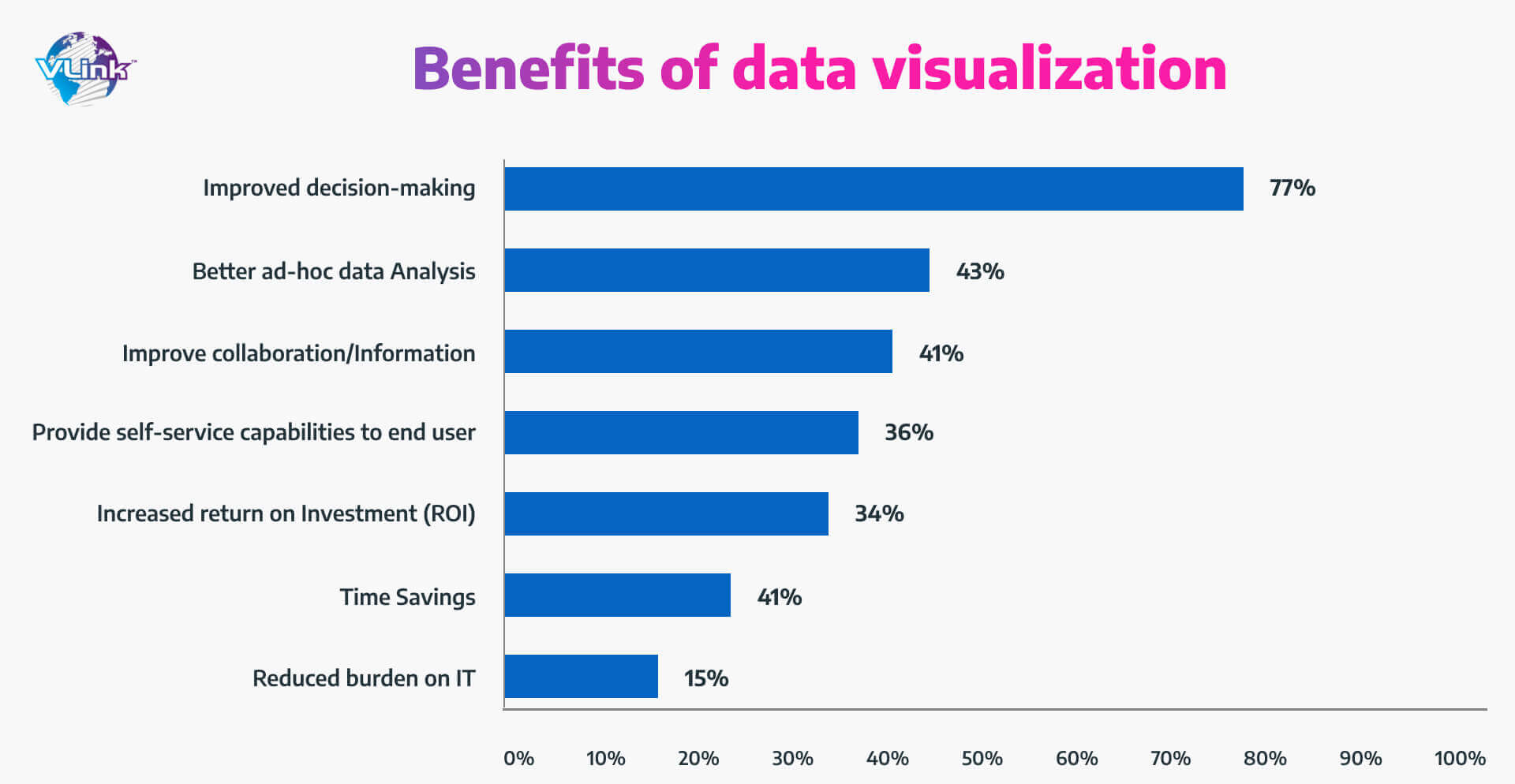
Better Analysis
A dataset – representing sales, investment, or any aspect of business – is just plain numbers when presented across hundreds or thousands of rows and columns.
Visualization allows you to convey the meaning behind your table reports in a way that is easier for the stakeholders to understand, analyze, and get actionable takeaways.
Reduced Burden on IT
Powerful visuals can influence how we interpret and retain information more than properly collated reports. In result, the stakeholders can easily keep themselves updated with new insights and take quick decisions for business growth.
Time-Saving
Big data integration centralizes business data storage, leading to cost savings. With tracking analytics, companies can enhance operational efficiency and reduce costs whenever possible.
Faster & Better Decision Making
From stakeholders to executives to decision-makers, everyone can benefit from data visualization. A simple chart is a better way to help businesses identify patterns in a long way.
It opens the doors to conclusions that increase and improve the decision-making process.
Better Team Communication
Data visualization leads to increased team productivity and operational efficiency.
In addition, it can’t be overstated at a time when global organizations are implementing remote work regulations.
Increased ROI
Data visualization can show low-revenue software, unnecessary expenses, and unpredict new markets and unused demographics. It can effectively highlight successful & expose areas and help you understand and replicate historical growth reports.
7 Common Types of Data Visualization
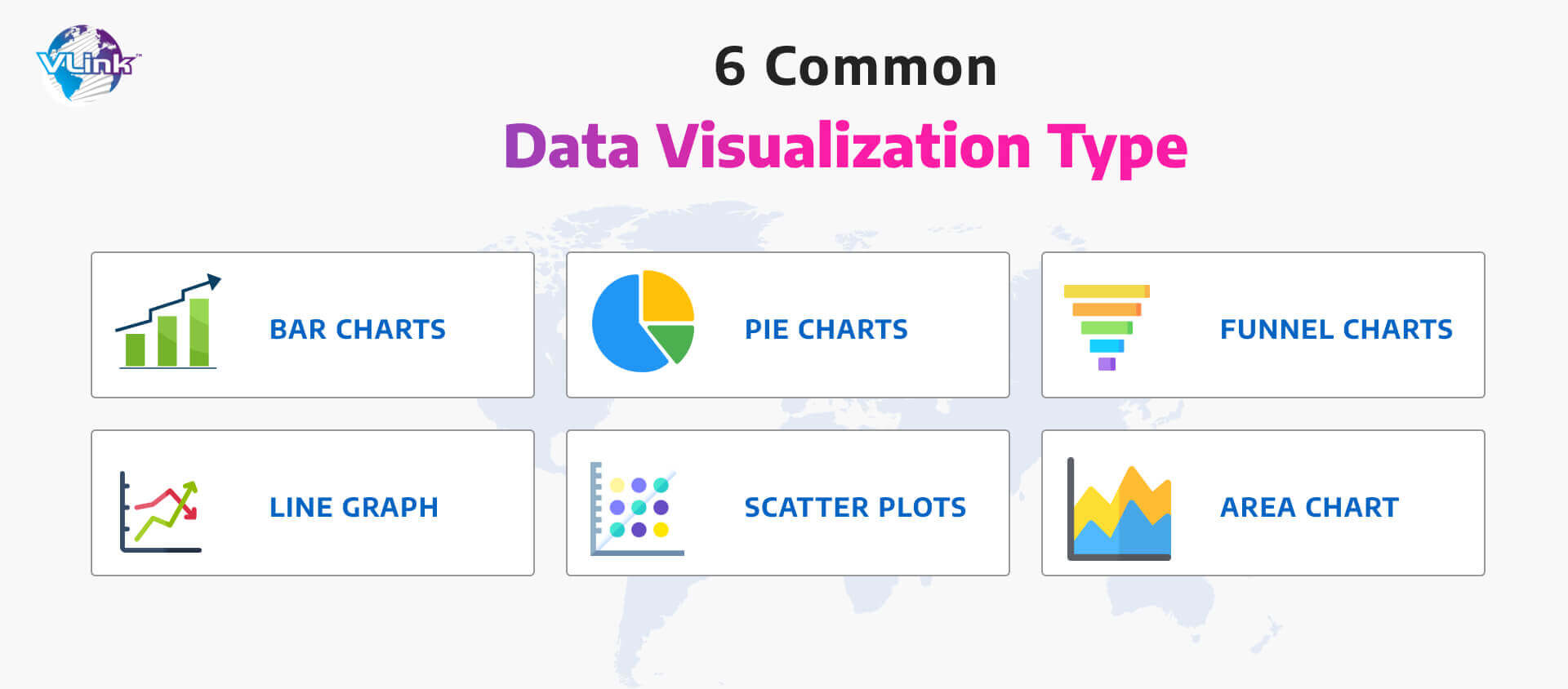
Here are seven common types of data visualization with their overview:
Bar Charts: Best for Comparing Large Differences
A bar chart (a bar graph) shows data with the aid of different heights’bars.
Two types of bar charts: vertical & horizontal.
The bar chart allows for effortless data comparison across different variables simultaneously.
For example: With a bar chart, you can compare your company’s sales from this year to last.
When to use a bar chart?
- If you want to compare several different categories
- If you need to represent how large data changes over time
Pie Charts: Best for Simple Overlapping Data
A Pie Chart is a circular graph that uses “pie slices” to visualize relative data sizes. A perfect choice for displaying data in (%).
When to use a pie chart?
- If you need to show the share of each value
- If you need to represent how a group is broken down into smaller pieces
Funnel Charts: Best for Composition Visualization
A funnel chart shows users' flow via sales or another business process. It’s very useful for identifying potential problem areas during this procedure.
When to use a funnel chart?
- If you want to show stages in a sales or other business process
- If you need to display the amount of revenue for each stage
Line Graph: Best for Relative Input Amounts Tracked Over Time
A line graph (also called a line chart) shows the values of something over a specified period.
Straight lines connect data points that display the values.
When to use line graphs?
- If you want to represent trends for different categories over the same period
Area Chart: Relative Input Amounts Tracked Over Time + Easier to Visualize Differences
Like a line graph, an area chart represents the change in one or more quantities over time. It’s good for showing trends and indicating changes among multiple data groups.
When to use an area chart?
- If you want to use multiple lines to make a comparison between series
- If you need to monitor not only the complete value but also want to understand the breakdown of that total by groups
Scatter Plots: Best for Simple Two-Variable Display
A scatter plot represents a relationship between two variables. Its main purpose is to represent how much one variable affects another.
When to use a Scatter plot?
- If you need to analyze and show relationships between two numeric variables
- If you want to visualize the correlation between 2 large datasets quickly
Top 7 Data Visualization Tools
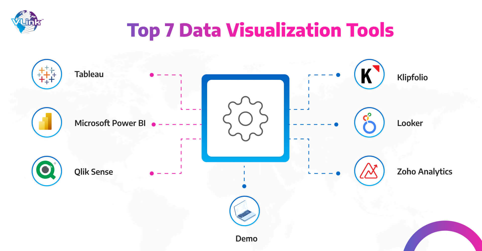
Here are the seven best data visualization tools for business (recommended by Forbes):
Microsoft Power BI: Best for business intelligence
If you use MS software & services and are looking for a business intelligence solution, Microsoft Power BI is the right choice!
Why choose it?
- It provides real-time analytics and trend analysis for confident decisions.
- It integrates with many MS software and cloud services, making it a versatile business solution.
- It is a powerful platform for creating engaging dashboards and reports that allow you to take action.
Pros:
- It has a mobile app
- Competitive Pricing
Cons:
- Heavy CPU usage
- Not compatible with Mac
Tableau: Best for interactive charts
If you want data visualization and analytics capabilities to scale your data operations, go with Tableau.
Why choose it?
- It saves time and money
- Provides security, compliance, maintenance and support
- Explore data and share insights
Pros:
- Storytelling dashboards
- Salesforce backs it
- Integrates with Slack
Cons:
- Steep learning curve
- Prices are higher compared to similar products
Qlik Sense: Best for artificial intelligence (AI)
Organizations looking for AI capabilities to scale their data operations use Qlik Sense.
Why choose it?
- It provides analytics performance and scalability to all sizes businesses
- it’s available as a software-as-a-service (SaaS) solution or as a hybrid service
- It understands and uses data more effectively
Pros:
- Automated action triggers
- AI insights
- Drag-and-drop interface
Cons:
- The user interface needs work
Klipfolio: Best for custom dashboards
Thanks to unlimited dashboards with every plan, Klipfolio is ideal for businesses requiring custom dashboards.
Why did you choose it?
- Flexible payment plans with no lengthy contracts or onboarding fees
- Its powerful data modular allows you to leverage data in everyday decision-making
Pros:
- Offers a free plan
- It has hundreds of integrations
- Unlimited dashboards, metrics and viewer users
Cons:
- The free plan doesn’t include downloadable PDF reports
Looker: Best for visualization options
Businesses seeking various data visualization options to scale operations can go with Looker.
Why choose it?
- Plugin marketplace
- Pre-made analytical blocks
- Easy to make data-driven decisions faster
Pros:
- Plugin database for a variety of visualization types
- Stunning visuals
- Drag-and-drop interface
Cons:
- Data-heavy visualizations can slow down the tool
- Not as customizable as other tools
Zoho Analytics: Best for Zoho users
Any business already using Zoho apps can choose Zoho Analytics for easy & quick integration.
Why choose it?
- A drag-and-drop interface
- Publish reports and dashboards via email
Pros:
- Sign up in less than a minute
- Offers a free plan
Cons:
- Premium support costs extra
Domo: Best for custom apps
Domo is an ideal choice for small businesses that want to understand data-driven decision-making effectively.
Why choose it?
- Easy-to-use interface
- Governance tools help companies who have access to data
Pros:
- Create pre-built one or more templates
- Custom seat visualization tool
- More than 150 interactive charts
Cons:
- Pricing isn’t transparent
- Must speak to its sales team for a custom quote
Real-World Examples of Data Visualization
There are a few real-world examples of data visualization:
Data Science
Data scientists and researchers can access libraries using programming languages or tools such as Python or R.
Professionals use data visualization techniques to derive actionable insights & work more efficiently by coding research with colors, plots, lines, and shapes.
Marketing
Marketers can identify their customer’s buyer journey by tracking data such as web traffic and social media analytics.
Charts or graphs can incorporate data for marketers and stakeholders to understand these trends better.
Finance
Line graphs or charts help financial analysts, investors, and advisors visualize data (buying & selling stocks, dividends and bonds), toggling between months, years, and even decades.
Health Policy
Policymakers can use choropleth maps, divided by geographical area by colours. These maps can demonstrate cancer mortality rates in different parts of the world.
Consider VLink as your trusted Data Visualization Consultant!
At VLink, we offer data visualization advisory, implementation, and support services to help you transform large, complex datasets into appealing visuals. Our dedicated professionals understand the value of professional data visualization services for businesses.
They offer advanced visualization tools and widgets that help plot the data insights concisely and meaningfully. In addition, we enable data visualization for customers to spot trends, track business goal achievements, and compare the performance of various categories, products, brands, etc.
We cover different data visualization use cases, including corporate performance, Financials, manufacturing, supply chains, assets, marketing and sales.
Conclusion!
Suppose you’re searching for data visualization consultants to help you take your business to the next level. In that case, VLink is here to help the marketing team, sales team, customer service vertical, and business executives make informed decisions faster with visual explorations of easily interpreted data.
Our cloud data visualization services can do much more for your organization. Let our dedicated team help you pick advanced discovery and visualization tools and get expert advice to plan your business decisions.

Vice President, Strategy – VLink Inc.
Sambhavi Gopalakrishnan is the Vice President of Strategy at VLink Inc., bringing over a decade of experience in IT leadership, project implementation, and strategic growth. She possesses a strong foundation in technical project management and pre-sales, driving innovation and business transformation at VLink.

 Shivisha Patel